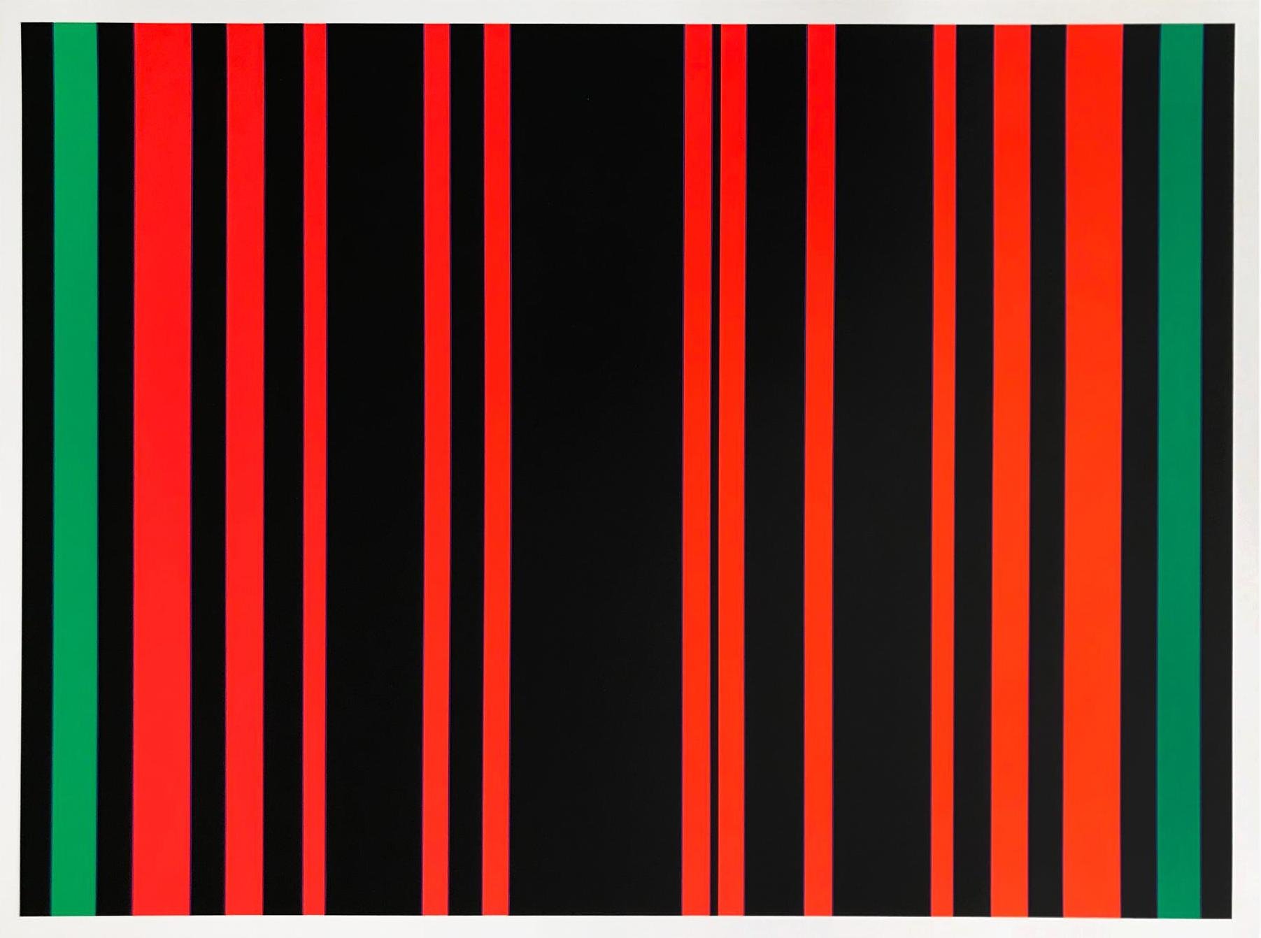
// Between Green by Günter Fruhtrunk is a 1970 screen-print that exemplifies the artist’s bold approach to geometric abstraction and Op Art. The composition features alternating vertical stripes of vibrant red, green, and black, arranged in varying widths. The contrast between the intense colors and the stark black background creates a rhythmic visual impact, drawing the viewer’s eye along the lines and generating a sense of movement. Fruhtrunk’s work often explores the interaction of color and form to produce optical effects, and this piece is no exception, with the repetition and color contrast giving it an almost pulsating quality. The print invites viewers to experience color as a dynamic force, embodying the principles of kinetic art.
Artwork Copyright © Günter FruhtrunkGünter Fruhtrunk (Germany, 1923–1982) was a German painter and printmaker associated with Op Art and Constructivism. His work is characterized by dynamic geometric patterns and vibrant color contrasts, exploring movement and spatial tension. Fruhtrunk's artistic style significantly influenced post-war European abstraction, and he also taught at the Munich Academy of Fine Arts.
Artwork Copyright © Günter FruhtrunkBetween Green, 1970
Form
Medium
Size
- Inches
- Centimeters
Edition
Price
Available works →
- Authenticity Guaranteed
- Insured Shipping
- Online Since 2005
●
●Inventory 7017
●Signed
●Comes with gallery invoice and certificate
●Sell Us a Similar Artwork. Learn more.
// Between Green by Günter Fruhtrunk is a 1970 screen-print that exemplifies the artist’s bold approach to geometric abstraction and Op Art. The composition features alternating vertical stripes of vibrant red, green, and black, arranged in varying widths. The contrast between the intense colors and the stark black background creates a rhythmic visual impact, drawing the viewer’s eye along the lines and generating a sense of movement. Fruhtrunk’s work often explores the interaction of color and form to produce optical effects, and this piece is no exception, with the repetition and color contrast giving it an almost pulsating quality. The print invites viewers to experience color as a dynamic force, embodying the principles of kinetic art.
Artwork Copyright © Günter FruhtrunkGünter Fruhtrunk (Germany, 1923–1982) was a German painter and printmaker associated with Op Art and Constructivism. His work is characterized by dynamic geometric patterns and vibrant color contrasts, exploring movement and spatial tension. Fruhtrunk's artistic style significantly influenced post-war European abstraction, and he also taught at the Munich Academy of Fine Arts.
Artwork Copyright © Günter Fruhtrunk- Recently Added
- Price (Low-High)
- Price (High-Low)
- Year (Low-High)
- Year (High-Low)

Günter Fruhtrunk
Between Green, 1970
Limited Edition Print
Screen-print
Currently Not Available
Related Artists


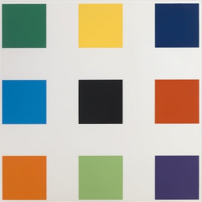
Artwork by Ellsworth Kelly
What is Hard Edge Art?
Hard Edge art is a style of abstract painting that became popular in the 1960s. It features areas of color separated by crisp, sharp edges that are painted with geometric precision. The term hard-edge painting was coined by art critic Jules Langsner to describe this approach, which contrasts with the softer, more fluid forms of other abstract styles.

Günter Fruhtrunk
Between Green, 1970
62 x 83 cm