Handcoloured aquatint
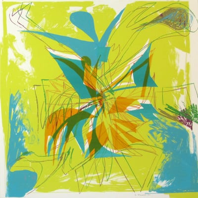
Without Title 10 by Matt Connors, a 2019 hand-colored aquatint, presents a vibrant abstract composition dominated by rich purple and yellow hues with accents of red and blue. The artwork features vertical bands interspersed with geometric shapes and soft-edged forms, creating a sense of movement and depth within the compact square format. The interplay of colors and shapes evokes a dynamic balance between structure and spontaneity. Connors’ use of bold colors and layered textures reflects his interest in the physicality of paint and form, resulting in an abstract piece that encourages viewers to explore color interaction and compositional rhythm.
Artwork Copyright © Matt ConnorsMatt Connors (USA, 1973) is a contemporary artist known for his abstract paintings that blend minimalism with vibrant color palettes. Drawing inspiration from poetry, design, and architecture, his work explores form and process. Connors has exhibited internationally, including at MoMA PS1 and the Whitney Biennial.
Artwork Copyright © Matt ConnorsWithout title 10, 2019
Form
Medium
Size
- Inches
- Centimeters
Edition
Price
Available works →
- Authenticity Guaranteed
- Insured Shipping
- Online Since 2005
●
●Inventory 7770
●Signed
●Comes with gallery invoice and certificate
●Sell Us a Similar Artwork. Learn more.
Handcoloured aquatint
Without Title 10 by Matt Connors, a 2019 hand-colored aquatint, presents a vibrant abstract composition dominated by rich purple and yellow hues with accents of red and blue. The artwork features vertical bands interspersed with geometric shapes and soft-edged forms, creating a sense of movement and depth within the compact square format. The interplay of colors and shapes evokes a dynamic balance between structure and spontaneity. Connors’ use of bold colors and layered textures reflects his interest in the physicality of paint and form, resulting in an abstract piece that encourages viewers to explore color interaction and compositional rhythm.
Artwork Copyright © Matt ConnorsMatt Connors (USA, 1973) is a contemporary artist known for his abstract paintings that blend minimalism with vibrant color palettes. Drawing inspiration from poetry, design, and architecture, his work explores form and process. Connors has exhibited internationally, including at MoMA PS1 and the Whitney Biennial.
Artwork Copyright © Matt Connors- Recently Added
- Price (Low-High)
- Price (High-Low)
- Year (Low-High)
- Year (High-Low)

Matt Connors
Without title 10, 2019
Limited Edition Print
Aquatint
Currently Not Available
Related Artists



Artwork by Ellsworth Kelly
What is Colour Field Painting?
Colour Field Painting is an abstract style characterized by large areas of a single color or simple, solid colors. The term was first used in the 1950s to describe the work of three American Abstract Expressionist painters—Barnett Newman, Mark Rothko, and Clyfford Still. Their work emphasized the emotional power of color and the creation of vast, meditative spaces through expansive color fields.

Matt Connors
Without title 10, 2019
53 x 48 cm